Payette.com
YEAR
2018
DESCRIPTION
Website Redesign
DESIGNED AT
Payette
DESIGN TEAM
Karen Robichaud
Joy Cohen
Mark Careaga
Leon Drachman
RECOGNITION
2019 SMPS Boston Award for Marketing and Communications Achievement, Website, First Place
TAGS
Graphic Design
Web Design
Designed in-house, the new payette.com was developed to reflect the firm’s strong online voice and presence. That meant encompassing not just a portfolio of work but also a platform for thought leadership, homes for branches of the practice like Building Science and Design Technology, and a prominent daily blog. Taken as a whole, the site serves as a reintroduction to an industry-leading architectural practice, the work they produce, and the people behind it: colorful, flexible, and vibrant.
The site was designed to be scalable by utilizing a six-column grid with break points for different screen sizes, from widescreen monitors to mobile devices. Custom modules for written and graphic content also adapt to different screen sizes to ensure a legible viewing experience, no matter the device.
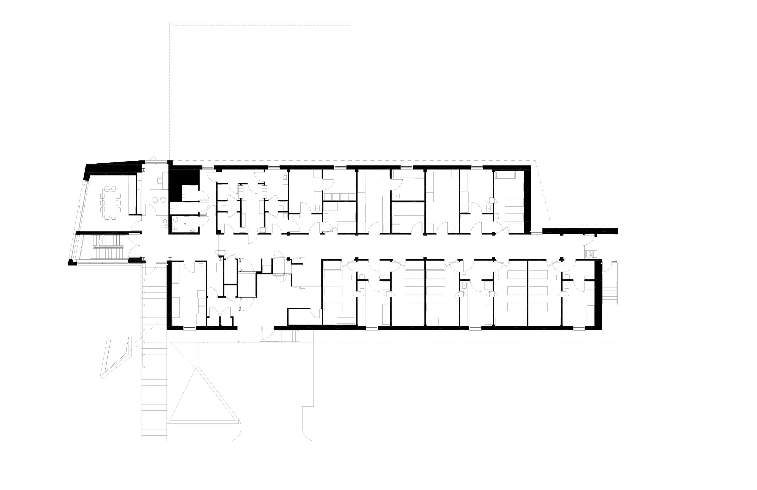
Key to the new website was the development of graphic standards for architectural drawings. Each project page now features a gallery of clean black and white drawings to emphasize the architectural quality of the project. Alongside plans and sections, each project page also features a newly drawn diagrammatic site plan, which situates the project within its unique context at a glance. These graphic standards were developed to work across a huge range of scales, from small research outposts to hospital complexes with millions of square feet, and both unify and elevate the graphic presentation of the firm’s work.
The graphic standards for plan drawings and site plans would be further developed for Payette’s first monograph in 15 years, Fusion.


©2024